Atmosferian T-Shirt Design
I always like casual designing like designing T-shirts without the influence of clients. Normally clients do limit my creativity on certain ways and can’t really explore and experiment it out freely. But seldom i got the chance of doing so in the office, so i have my chances working non-profitly for some of my friends :p like this one i am sharing here.
This 2010 personal project is actually a t-shirt design required by my friend for his condominium neighborhood. He wanted some identity for the owner club to be shown in the t-shirt. The rest of the creativity lies to my free mind. Anyhow, the main identity and tagline for Atmosfera Condominium is actually a dandelion bearing the tagline “Lifting me higher”. So, is a great start from there and to include that into 1 or 2 of my design.
I have managed to come out 7 designs with different unique and individual themes:
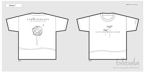
Design 1: Light and Easy
- Overall design concept is light which you can see in lighter and featherlike line arts to bring out the concept “Lifting me higher”.
- The front only show 2 dandelions being flying and the back up show the “source” from the dandelion branch which are being symbolized / tagged with “atmosferians my-kondominium” wording on top of the back shirt.
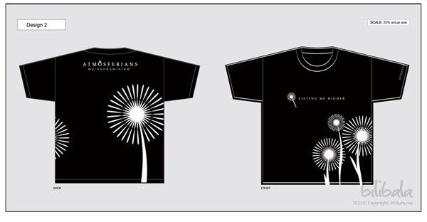
Design 2: The Stand-out!
- Overall the whole design is to make the element standout by using more solid graphics and color contrast (color can be vice versa – white background and black element)
- Similar concept with design 1 but using different art direction which plays more solid graphics and increasing more dandelion branches to give more standout presentation.
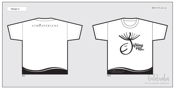
Design 3: That’s me! An Atmosferian!
- Overall concept is avatar based representation of atmosferians.
- I was trying to blend human element into the dandelion to show the relatedness between 2 of them.
- This is more straightforward approach that you ARE the dandelion (“atmosferians”) .
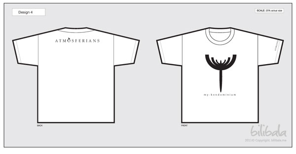
Design 4: Tribe Atmosferian!
- Overall concept is just using a tribal/tattoo type to represent atmosferians. Very urban look.
- Very standout “tribalized” of the dandelion, just as simple as that.
- The tribal IS the logo for the atmosferians.
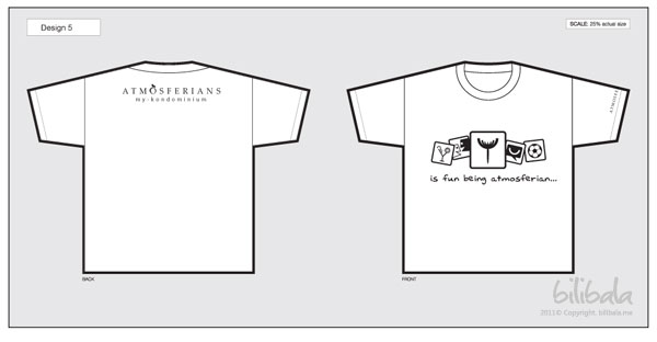
Design 5: Atmosferians Fun!
- I was thinking of the fun of being atmosferians with the use of icons to symbolize the element:
Drink (yumcha) + Friends + Our Atmosfera condo + Chit chatting (having nice time chatting) + Sports = Atmosferians! - Overall, is just FUN!
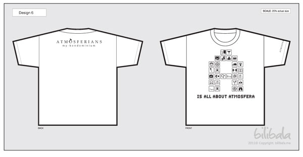
Design 6: A… Is Atmosfera!
- If you can notice that, I am actually using all 26 facilities of atmosfera + some element of atmosferians to combine and become the initial of Atmosfera (i.e. A). Try to see whether you can guess which icons symbolize which facilities :p
- Well, the fun of using this design is that you can remind yourself about the facilities we have for atmosfera and to tell others about it too :p
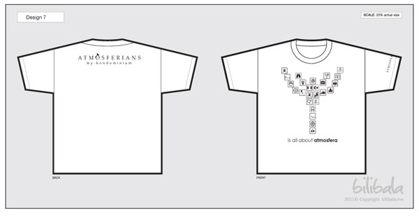
Design 7: Dandelion… is Atmosfera!
- Concept is similar to design 6 (A… is atmosfera!) – having symbolized 26 facilities into the design.
- But instead, I use it to combine into a big dandelion and a human raising hands :p. which of coz symbolizing atmosferians.
What’s the result?
Well, which one you like? Anyhow, design is a very subjective matter, it is more of a personal preference.
In the end, they didn’t choose any of the design. It was a nice try though! 🙂 Another experience gained.
If you like to know more about Atmosfera Condominium, you can click here.

Another idea is ask your readers for comments and responses in your blog posts. Engaged readers tend to visit more often.
Thanks for your suggestion ya. Will definitely do that in upcoming blog post 🙂 Thanks for dropping by too.
this post is very usefull thx!
Thanks for dropping by
Do you people have a facebook fan page? I looked for one on twitter but could not discover one, I would really like to become a fan!
Hi there, currently i dont have a facebook fan page yet. I will create a facebook fan page soon 🙂 Thanks for the support ya.
hahaha.. u like the “less” hair character? :p
i like design 3 🙂 prefer it in BLACK.